Monday, October 21, 2013

Logo Remix

1968 Ford Mustang remixed with vintage advertising mottos, models, and some words I threw in.

Monday, October 7, 2013

Tony Robbin

Tony Robbin is a digital media artist, painter, and sculpture from Washington, DC. Robbin's main theme throughout his works is geometric and cubistic shapes. Robbin uses the program Formian and software that he designed himself to create his computer drawings. Tony Robbins first started to show his work in 1974 at the Whitney Museum of American Art. Since then, Robbin has shown his work in over a hundred shows throughout the world. Robbin also holds the patent for the application of quasicrystal geometry (4-dimensionalism of geometric shapes) to architecture. Tony Robbins has authored several books, papers and articles, including his book Shadows of Reality: The Fourth Dimension in Cubism, Relativity, and Modern Thought where Robbin discusses the fourth dimension and its application to art. 

Tony Robbin uses different media, such as acrylic on canvas or digital printing in his artwork, but the use of geometric shapes continues throughout all of his artwork. In the painting below, Robbin uses several different lines and geometric shapes in order to create many different planes throughout the piece. 

The prints made from the computer reveal a similar theme. In this piece, the lines are more intricate and sharp, which adds a lot of dimension to the shapes and lines. Robbin used self-made computer programs along with Formian to make this work. The use of the computer allowed him to create several more layers of lines and shapes than he could previously with paint and canvas.

Overall, I find the work of Tony Robbin creative and intellectually stimulating, but all of his work is very similar to the next. Robbin does not name his pieces with anything other than numbers, which makes all of them seem to blend together for me. I enjoy how he uses simple shapes to create a completely new dimension. The colors he used in his computer drawings seem to compliment the work.  The shapes placed on the outer edge of the main box make it seem like the shapes are flying out of the screen into the world in which you currently reside. This arrangement of shapes and colors remind me of being taken into another dimension altogether, like drifting through a space of geometry. I think the work created by Tony Robbins is very effective, but you need only to observe one or two of his pieces in order to understand the main theme of all of his works. 

Source Links:
http://tonyrobbin.net/art.html
http://tonyrobbin.net/work.htm
http://retrospective.tonyrobbin.net/bio.html

Monday, September 23, 2013

Jason Salavon


Jason Salavon is a digital artist from Indianapolis,  Indiana. He studied Fine Art at the Art Institute of Chicago where he obtained his MFA and the University of Texas where he obtained his BA. Salavon uses software that he designed to create his art work. A main trend in Salavon's work is the reconfiguration of familiar things in order to present new ideas on the subjects. Salavon's art work has been shown in exhibitions across the United States. He has also had solo exhibitions across the world in cities such as Paris, Seoul, London and Geneva.

Jason Salavon's work is characterized mostly by collaging several different pictures to create a completely new image.  This is demonstrated in the <Color> Wheel where Salavon combined thousands of different pictures and sorted them by their main color to create a color wheel.
Another interesting work by this artist is The Top Grossing Film of All Time, 1 x 1 (pictured below). In this work, Salavon has digitized the movie The Titanic. He then split the movie into all of its frames and averaged out the color for each frame. He then sequenced these frames in order to form a collage that represents The Titanic in its color entirety.
 
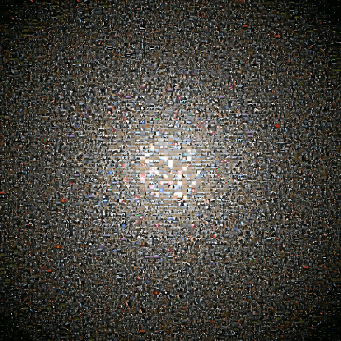
Salavon also created an image using the film Star Wars III (shown below). Here, he used techniques from both images shown above. The work, The Grand Unification Theory (Part One: Every Second of Star Wars) was made by collecting each second-long frame from the movie and sequencing them into a visually interesting collage. If zoomed in, you can recognize many of the pictures that comprise this image.


Overall, I think Jason Salavon's work is quite interesting. I really enjoy how he can transform the familiar into the completely unfamiliar. I especially liked the piece made from the scenes from The Titanic. The composition of this piece largely resembles a glitched image, but the background story makes the work very interesting. The colors representing the scenes in the movie make complete sense when viewed in chronological sequence. The viewer can see that the colors near the top of the image are brighter and have slightly more variation in hue and vibrancy. Also, the colors toward the bottom of the picture are darker, with less variation in hue and vibrancy. These sequenced colors are easy to relate to the film because the first half of the film is happy and cheerful while the second half is obviously tragic and sad. Jason Salavon's work is unique because it makes the viewer think: what could this possibly represent? With a background story, these images present us with new perspectives on familiar subjects.
 
 
Sources:

Animal Mash-up

Giraffe-Zebra